Many thanks to the editors at Kitchen & Bath Design News for featuring one of my complete kitchen renovations in the latest issue of their monthly magazine. They did a wonderful job describing the problems I confronted and the solutions I created for this project. Though the floorplan for this interior “floating” kitchen presented a challenge, I was able to open up sight lines, integrate the room with the rest of the house and create a functional, attractive space. Here are some photos in addition to those in the article:
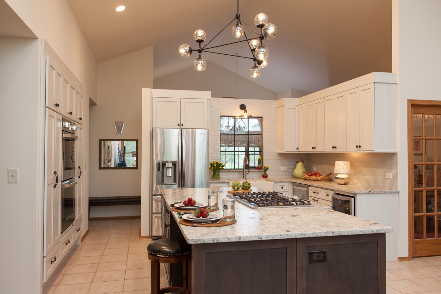
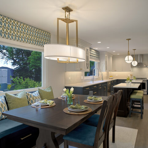
A Dark Wood Island Pairs Beautifully with White Perimeter Cabinets
In this view you can see the stained wood, mullioned door to the dining room on the right, located conveniently close to the kitchen. I extended the countertop along that wall to provide a place for the dishes removed after meals. White cabinets were a must-have for these clients, but I balanced them with stained-wood island cabinets (all from CrestwoodCustomCabinets), which integrate the kitchen with other dark wood elements throughout the house. I also created symmetry and more storage by making all of the cabinets the same height, increasing their size and eliminating a seldom-used desk. The taupe and soft white granite countertop from TerrazzoandMarble draws its color palette from the cabinets.
Creative Problem Solving
When I redesigned the L-shaped island into a rectangle, it left a gap between the cabinetry and the existing floor tile—which the clients wanted to keep. To solve the problem, I chose a mosaic tile border in complementary colors from DalTile that looks like it was installed with the original floor. In order to add a second oven, I eliminated the existing single oven and created an appliance wall opposite the island with a double oven from LG Appliances, framed by panties, cabinets and drawers. The island drawers are yet another update. I always recommend drawers to my clients instead of cabinets, to eliminate the two-step process of opening cabinet doors and pulling out rolling shelves to access cookware.
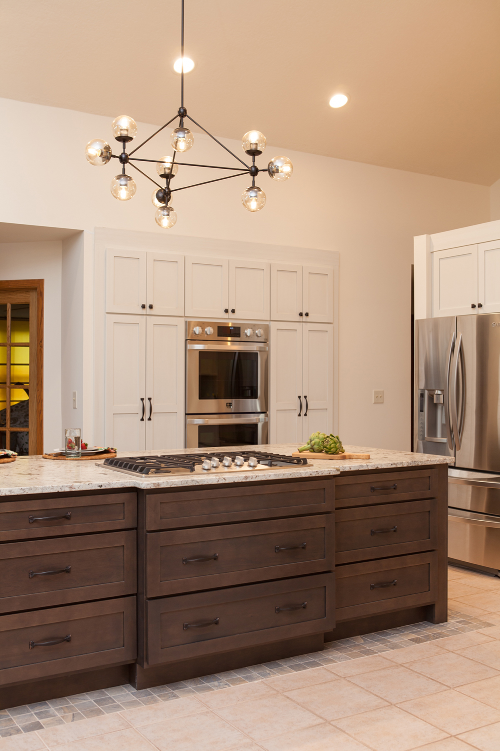
A Glass Mosaic Tile Backsplash adds Texture
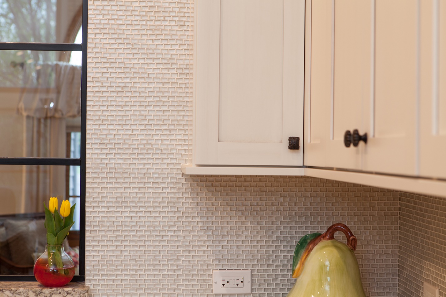
This close-up shot spotlights the texture and pattern of the glass backsplash tile from MidAmericaTile. I chose a quiet color that directs focus on the ridged texture and blends well with the cabinets.
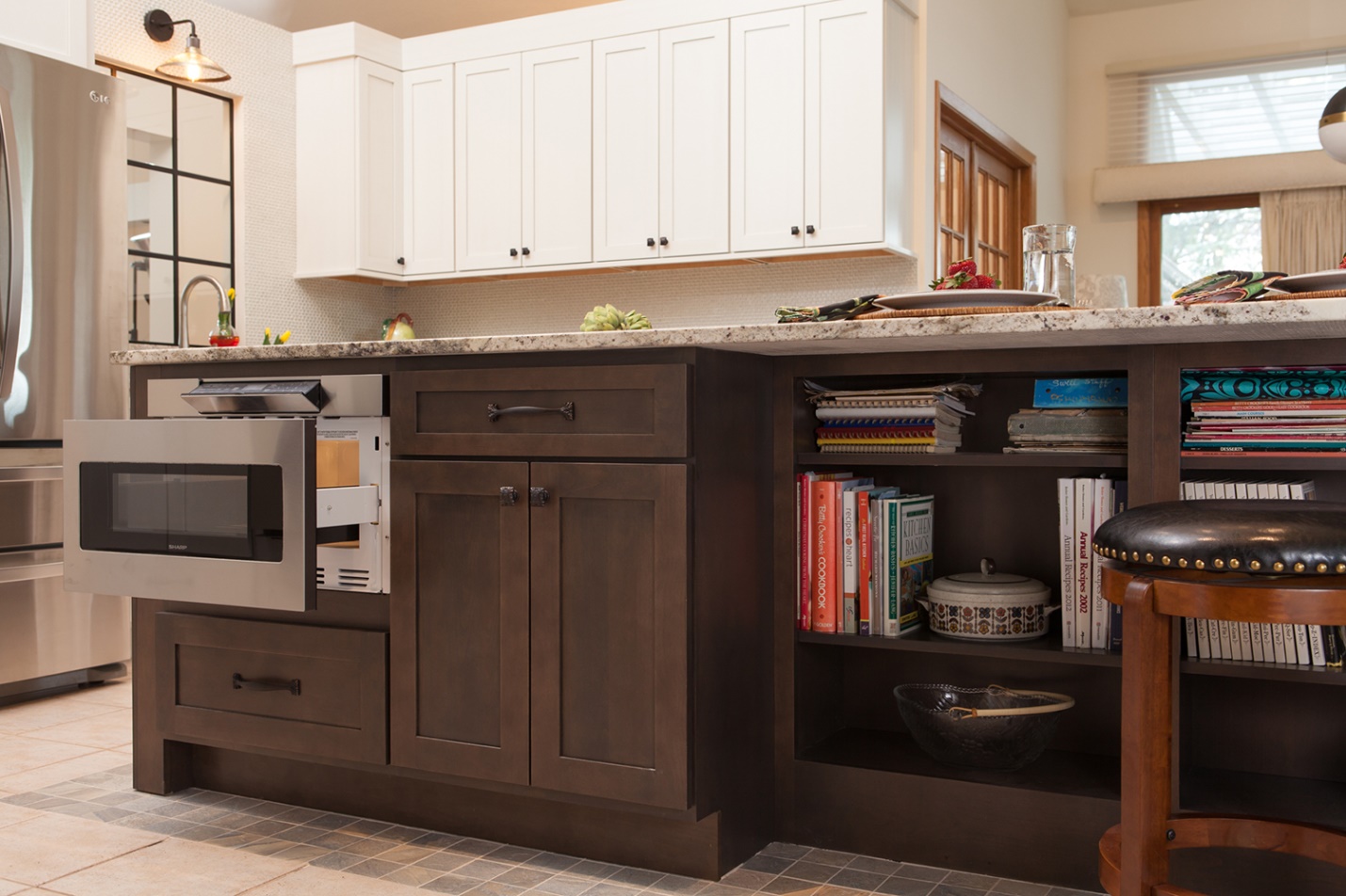
This side of the kitchen island is packed with solutions, from the SharpUSA drawer microwave to the additional cabinets and draws, plus the open shelving for our clients’ cookbook collection. Notice that I recessed that area to create room for the counter stools.
The completed kitchen has an improved traffic pattern, 36 square feet of additional storage, more cooking space, improved sight lines and is better integrated with the rest of the house. Thanks again to Kitchen & Bath Design News for putting this kitchen in the spotlight!
