What is the first thing you do when you’re on the verge of becoming empty-nesters? Well, these clients decided to completely renovate their primary bath! Why not? Their bath had not been updated in 20 years. As working professionals entering a new phase of life, they truly appreciate having a beautiful, refreshing environment where they can start and end their days.
Working Wonders Within an Existing Space
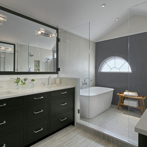
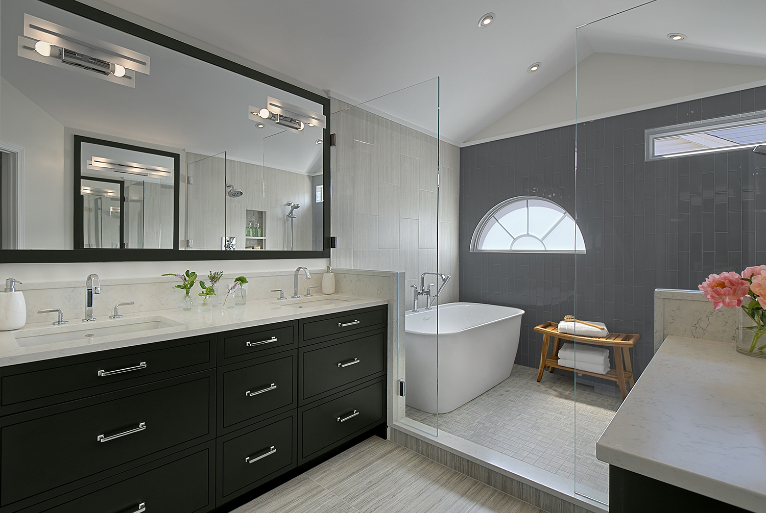
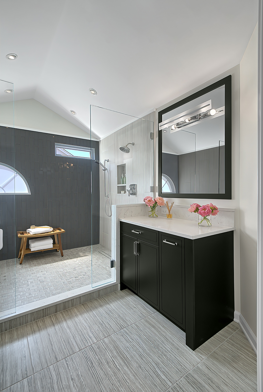
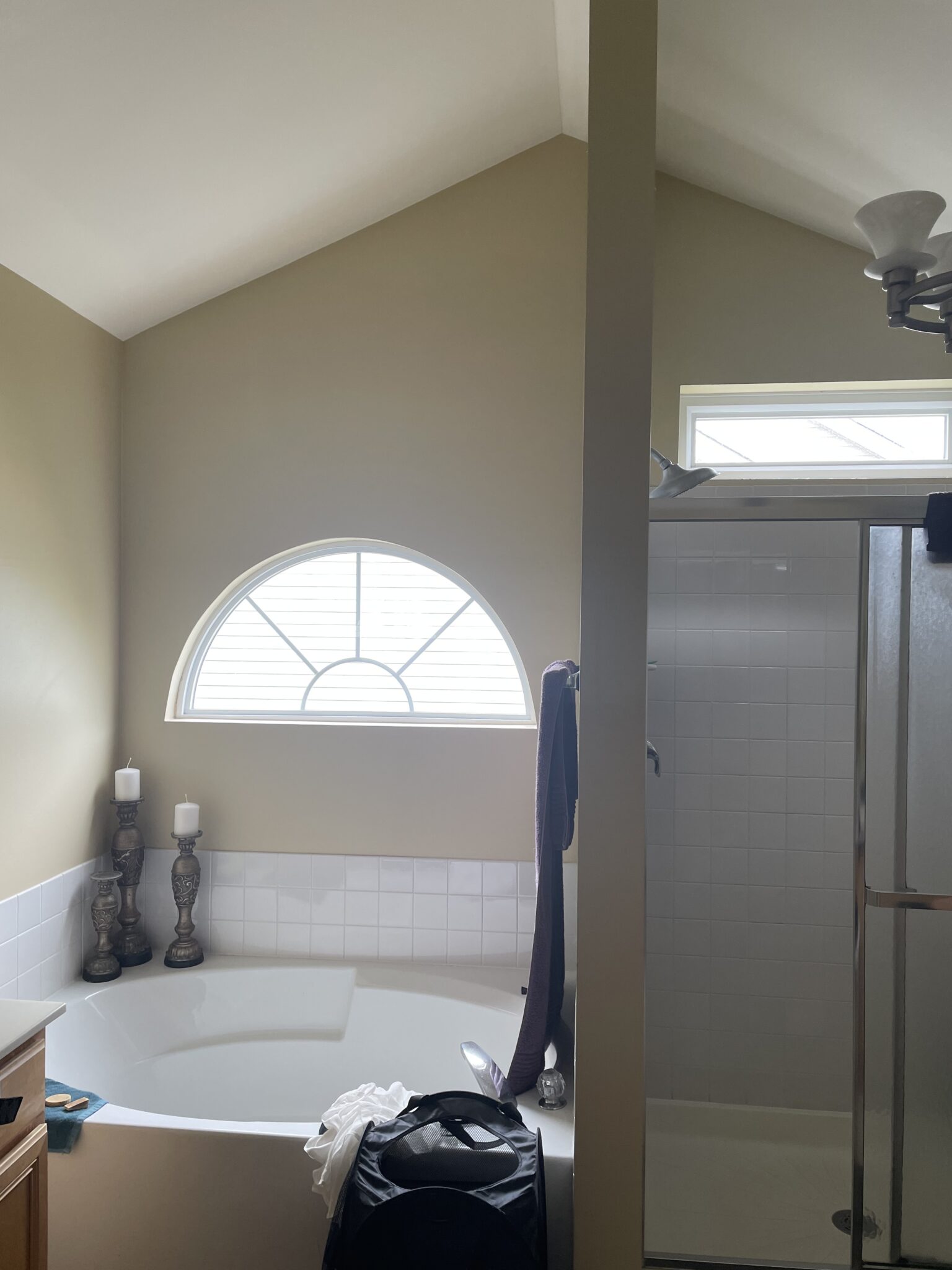
Without increasing the space by a single square foot, I transformed this dated room into the primary bath my clients envisioned, while adding elements that they hadn’t imagined. I increased storage, visually opened up the space, improved function and updated every element, from the cabinets, countertops and tiles to the hardware, faucets and tub. My first major design choice was to remove the existing wall between the shower and tub, which had made the space feel choppy and enclosed. As a result, I created a spacious “wet room” that doubled the size of the shower while including a new tub. Now my clients have an open, airy, dual-purpose space. The partial glass walls offer easy access to this space while adding to the wide-open feeling.
To give the space some fresh energy and panache, I chose dark, Essex green cabinets with clean-lined chrome hardware that really pops against the grey-and white backdrop. It’s a sophisticated look that will stand the test of time. In place of the existing single sink vanity, I was able to include a double sink vanity while increasing the vanity height to a more comfortable level and doubling storage. That was a win-win-win!
Not only are those handsome maple cabinets a rich shade of green, they are environmentally “green” too. My supplier, Crestwood Cabinetry, made them of NHLA-certified (National Hardwood Lumber Association), sustainably grown and harvested trees from North America. Maple is fast growing and regenerates naturally, which contributes to its sustainability. To seal them, I selected an eco-friendly, low-VOC finish with no formaldehyde.
Mixed Textures and Shapes Boost Tile Style
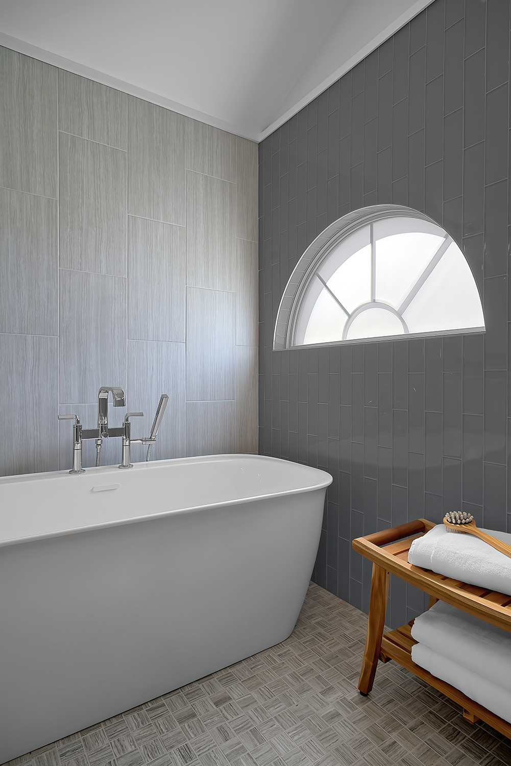
To add more texture and interest to this master bath, I chose three different tiles: large-scale vertical tiles on the bathtub wall, glass subway tiles on the window wall and small-scale tiles with a linear pattern.
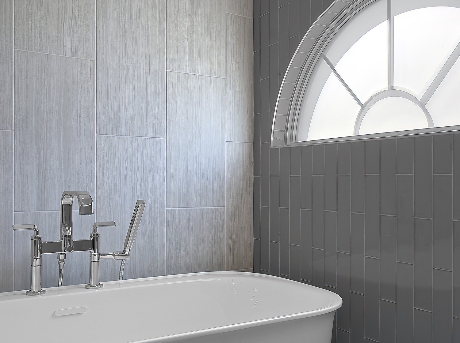
In a perfect world, I would have replaced the half-circle window in the bathroom, but it was not practical. Instead, I updated the wall surrounding it with glass tile, and for privacy, I added a durable film layer to the window pane, like frosted glass.
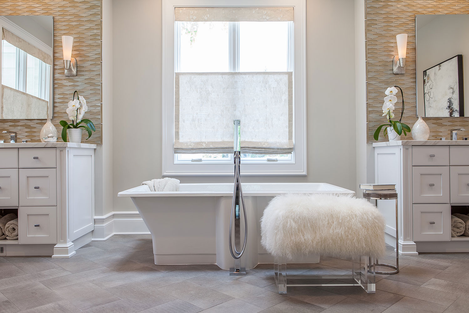
Notice the cute wooden bench? Every bath should have a convenient spot like that for towels, bathrobe or whatever you like to have handy next to the tub. A rubber duck, perhaps? Haha! Of course, wood is only one option. I have chosen more unexpected options for other clients, such as the long-haired goat bench pictured below, which lives in a bachelor physician’s primary bath!
Style Meets Safety
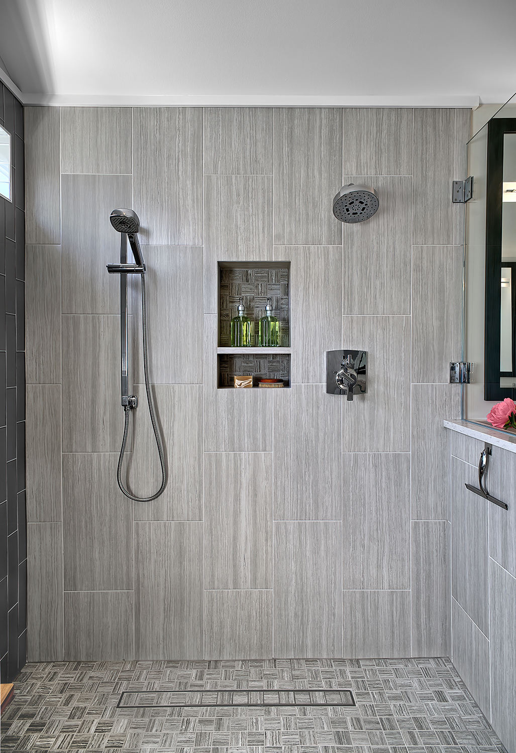
Safety, storage and style, of course, are always top concerns for my bath projects. In this case, structural issues precluded a zero-threshold shower, so I increased safety by lowering the shower curb as much as possible. Notice the small format floor tiles? They require more grout lines, which also help prevent slipping.
Storage Solution/Tile Tricks
My clients’ primary bath always looked cluttered because they had no built-in storage for toiletries, which they had to place on the floor and on the top of the shower door ledge. I updated the new space with generous nooks for shampoo, body wash and other sundries. Now they have room for everything and a neat, elegant appearance. To add visual height in the primary bath, I replaced the partially tiled shower and tub walls with ceiling-height, 12 x 24-inch wall tiles installed vertically to make the space look taller. My clients particularly enjoy the two shower heads—one fixed, one removable—which allows them to get ready for a special outing at the same time.
Storage Solution
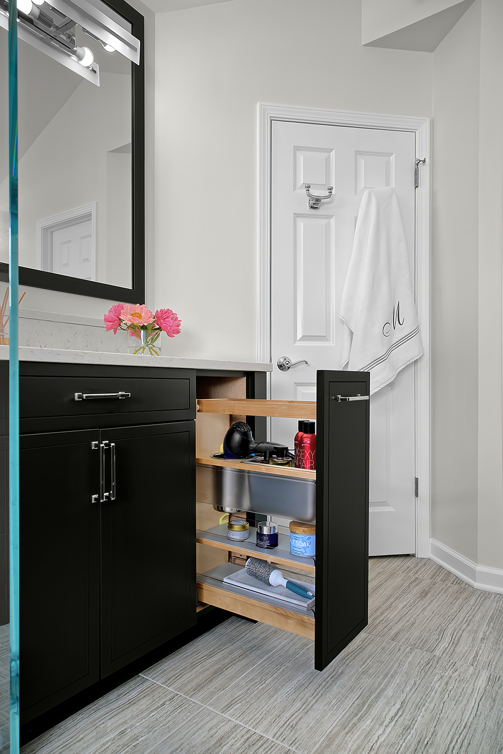
To create more storage, I replaced an awkward, space-hogging knee wall with a wider vanity that has a vertical roll-out drawer with plug-ins for hair appliances and space for hair products, brushes and combs. Talk about easy-to-reach function and five-star organization! To make the vanity more comfortable to use, I increased the height, as I did for the double vanity across from this one.
Best Depth for Soaking Tub
I don’t know about you, but when I take time for a long soak in the tub, I want the water to be over my shoulders. Otherwise, I’m cold and I don’t get the full, muscle-relaxing benefit of a hot bath. For this renovation, I replaced the existing, too-shallow tub with a true soaking tub from Build.com and my clients love it.
Check Out This Before Photo!
We Can Transform Your Bath, Too!
Making this space much more functional, welcoming and beautifully updated has made a big impact on the quality of my clients’ lifestyle. They feel pampered, relaxed and rejuvenated.
Ready to renovate your bathroom? Get in touch or check out our other blog post on remodeling your primary bath.
